Your bedroom is your sanctuary, the one room where the environment directly affects your health and wellbeing. And yet, most people choose bedroom colors based on aesthetics alone, without considering how those colors influence sleep quality, stress levels, and mood. Color psychology offers powerful insights that can transform your sleep.
Design any room, shop or space with House AI in about 15 seconds. 1 free design a day.
Get Started TodayThe Science of Color and Sleep
Research shows that color directly affects the autonomic nervous system. Warm, aggressive colors like red and bright orange increase heart rate and alertness, the opposite of what you want at bedtime. Cool, muted tones signal safety and calm, helping your brain transition into sleep mode.
Best Colors for Restful Sleep
Soft Blue
The top choice for bedrooms. Blue lowers heart rate and blood pressure, creating a peaceful atmosphere. Choose muted, gray-toned blues rather than bright sky blue.
Sage Green
A natural, grounding color that connects us to nature. Sage and moss greens promote relaxation without feeling cold.
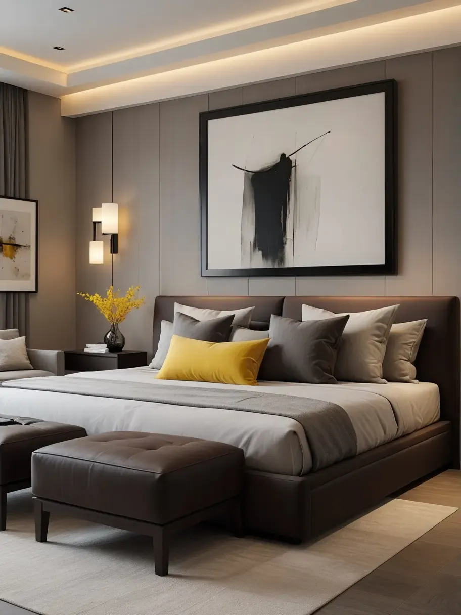
Warm Gray
A versatile neutral that feels sophisticated and calm. Pair with warm wood tones to avoid a clinical feel.
Lavender
A soft purple tone that combines the calm of blue with a touch of warmth. Best used on a single accent wall.
Soft Pink
Blush and dusty rose tones create a cozy, nurturing environment. More restful than you might expect.
Colors to Avoid in the Bedroom
- Bright red, increases energy, heart rate, and alertness
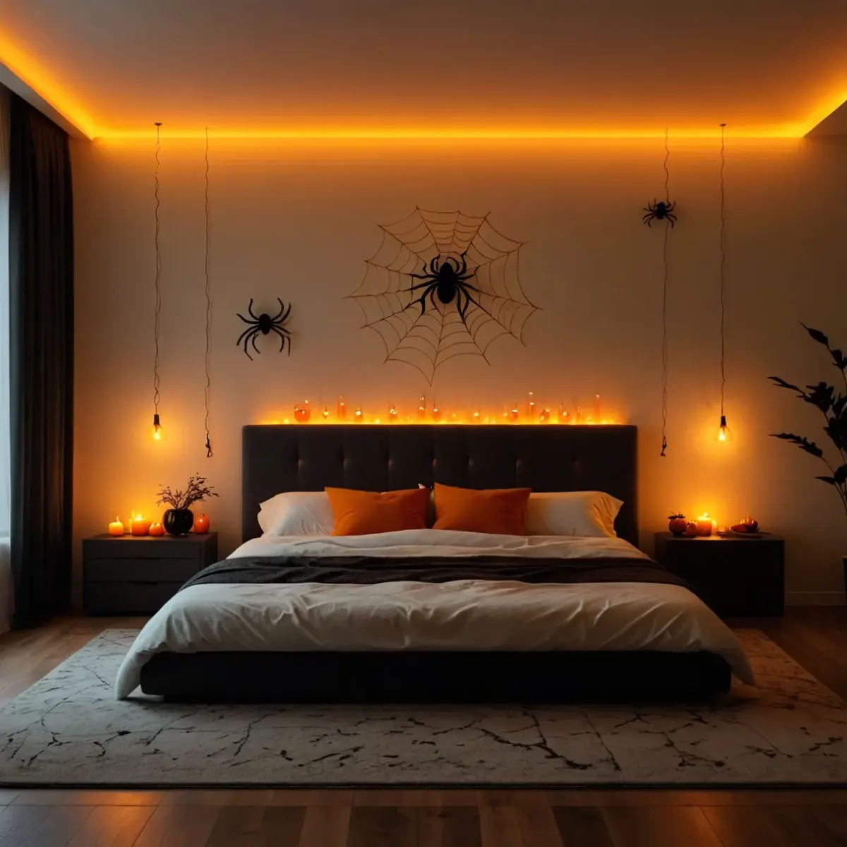
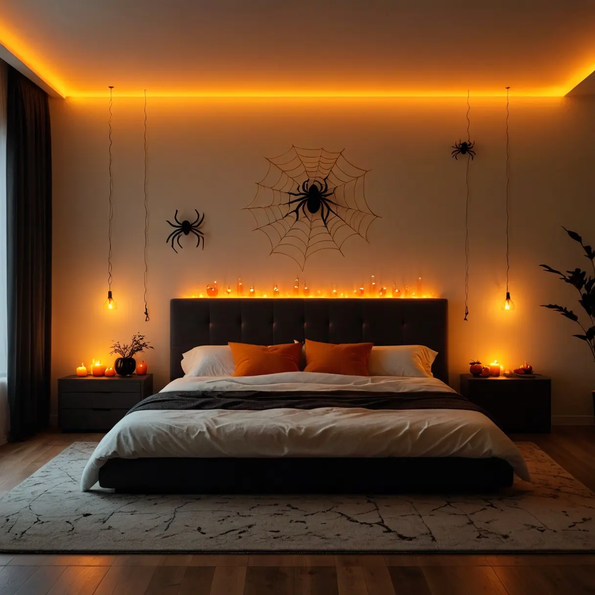
- Vivid orange, stimulating and better suited to kitchens and gyms
- Pure white, can feel clinical and stark without warm accents
- Dark black, may feel oppressive and make the room appear smaller
- Neon or fluorescent tones, disrupt circadian rhythms and melatonin production
Design any room, shop or space with House AI in about 15 seconds. 1 free design a day.
Get Started TodayHow to Test Colors Before Painting
Painting a bedroom is a commitment, and repainting because you chose wrong is expensive and frustrating. House AI lets you upload a photo of your bedroom and instantly preview dozens of wall colors and bedding combinations. See exactly how soft blue or sage green will look with your existing furniture and lighting.
Expert Advice: Paint your ceiling a lighter shade than your walls. This creates an enveloping, cocoon-like feeling that enhances sleep quality.
Find Your Perfect Palette: Upload your bedroom to House AI and test every color in seconds. Free to start.
Design any room, shop or space with House AI in about 15 seconds. 1 free design a day.
Get Started Today"I was about to paint my bedroom bright coral. House AI showed me how it would look, and I switched to soft sage green instead. I have been sleeping better ever since.", Sarah B., House AI User
Color psychology is one of the most overlooked tools in home design. By choosing the right palette for your bedroom, you are not just decorating, you are investing in better sleep, lower stress, and improved overall health. Start experimenting with House AI today.
How Do You Test a Bedroom Color Before Painting?
Never trust a 5cm swatch to predict a 15-square-meter decision. Photograph your bedroom and render it in the candidate colors with House AI, the render shows the color across every wall, in your room's actual daylight, with your actual furniture arguing back. Sage green and dusty blue in particular read wildly differently between showrooms and north-facing bedrooms; render first, buy second.
FAQ: Bedroom Colors
What is the best bedroom color for sleep?
Muted, low-saturation cool tones, soft blues, sage, warm gray-greens. Studies link blue bedrooms with the longest average sleep; the mechanism is low visual arousal, so any calm, desaturated shade qualifies.
Should a bedroom be dark or light?
Either works, the rule is contrast control. Light and airy soothes by day; a deep, enveloping color soothes by night. What disturbs sleep is high-energy contrast and saturation, not darkness.
Can I preview bedroom colors with AI?
Yes, upload a bedroom photo to House AI and generate it in each palette you are considering. It is the difference between guessing from a swatch and seeing the finished room.
Design any room, shop or space with House AI in about 15 seconds. 1 free design a day.
Get Started Today