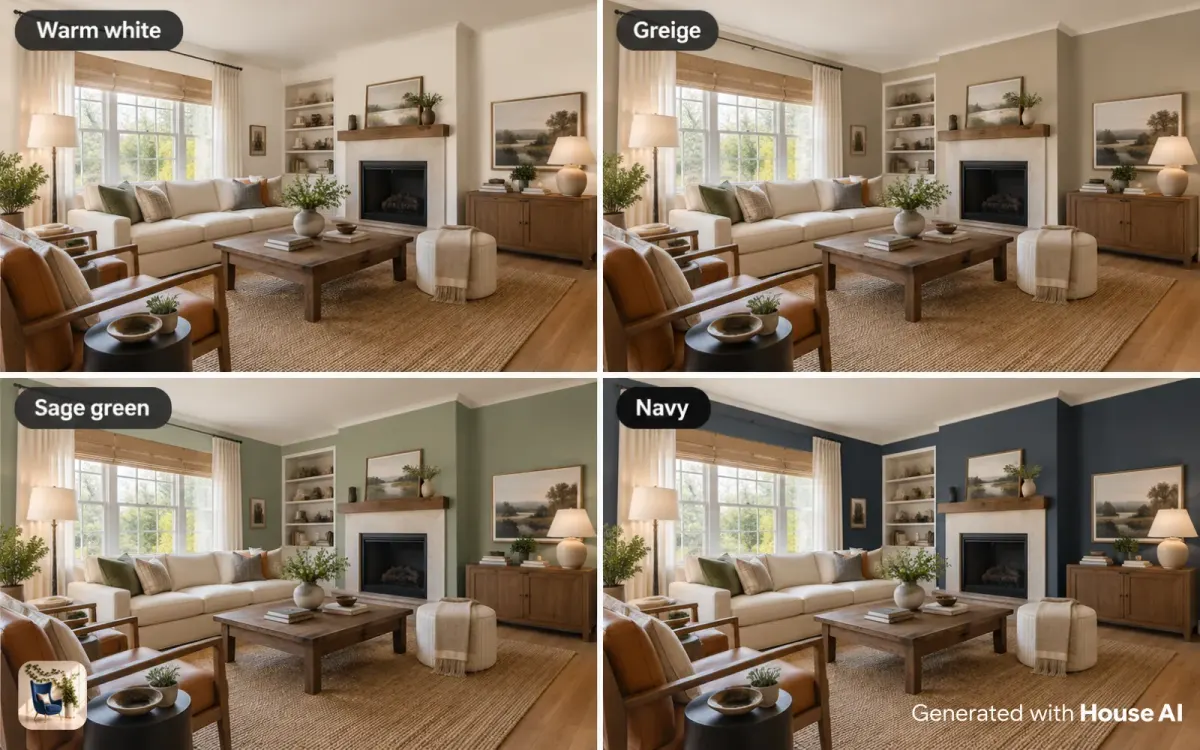
Choose a paint color in this order: start from what stays in the room, read the color's undertone, match it to the direction your windows face, check its LRV to see how light or dark it will read, then pick the sheen. Narrow it to two or three colors before you buy. House AI can show each one on a photo of your room in about 15 seconds.
A small chip under store lights tells you very little about how a color will look at home. The same color can look warm in one room and gray in the next, because the light, the floor, and the furniture all change it. This guide covers the decisions that matter, in the order that saves you the most repainting.
Start with what you are not changing
Pick paint last, after the things you can't easily change. Floors, countertops, tile, a big sofa, and wood trim are fixed for years, while paint can change in a weekend. The paint has to get along with all of them.
Look closely at those fixed pieces. A honey oak floor leans yellow. A gray tile may lean blue or green. A cream sofa leans warm. Write down whether each one reads warm or cool, because that list narrows your choice before you open a fan deck. If you also need to sort out mixed wood finishes, settle those first.
Read the undertone before the color
Every color has an undertone, the hint of another color underneath, and it matters more than the name on the chip. Two whites can look the same on a card and very different on a wall, one going slightly yellow and the other slightly blue. Undertones are why a gray can look purple in one room and green in another.
To see the undertone, hold the chip against a sheet of plain white printer paper, then next to a stronger color from the same family. The hidden color shows up in the comparison. Match warm undertones to warm fixed finishes and cool to cool.
| Undertone | What you see next to white paper | How it feels | Pairs well with |
|---|---|---|---|
| Yellow or red (warm) | A creamy or peachy cast | Cozy, sunny, soft | Oak, cherry, brass, terracotta, cream fabrics |
| Blue (cool) | A crisp or icy cast | Clean, calm, airy | Chrome, marble, white tile, cool grays |
| Green | An olive or sage cast | Earthy, relaxed | Walnut, jute, plants, warm metals |
| Violet or pink | A lavender or rosy cast in grays and whites | Soft, a little moody | Cool woods, navy, blush and plum accents |
| Balanced (neutral) | Little visible cast | Quiet, flexible | Mixed finishes and rooms that change light through the day |
Match the color to the light in the room
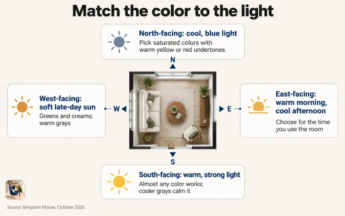
The direction your windows face changes how a color looks all day. Benjamin Moore's guide to light and color says light in north-facing rooms is cool and blue-toned, so colors with gray, blue, or lavender undertones look duller there. It suggests more saturated colors with a warm yellow or red undertone instead.
South-facing rooms get warm, direct, and sometimes intense light, and Benjamin Moore says nearly any color works in them. Cooler, grayer tones calm the glare. East-facing rooms are bright and warm in the morning and turn cool and blue by late afternoon, so choose for the time of day you use the room most. West-facing rooms get muted late-afternoon sun, where greens and creams do well, and any gray should be warm enough to counter the blue of evening light.
Artificial light changes color too. Warm bulbs push walls toward yellow at night, and cool bulbs push them toward blue. Decide on your bulbs before you decide on the paint, or at least judge the color under the bulbs you will actually use.
Use LRV to decide how light or dark to go
LRV, or light reflectance value, tells you how light or dark a color will read on the wall. Benjamin Moore defines it as the percentage of light a surface reflects, on a scale from 0 for absolute black to 100 for pure white. The number is printed on most color pages and on the back of many chips.
A higher LRV bounces more light around the room and makes it feel brighter. A lower LRV soaks light up and makes walls feel closer. For a sense of the range, Benjamin Moore lists White Dove at an LRV of 83.16, Revere Pewter, a greige, at 55.05, and Hale Navy at 8.36.
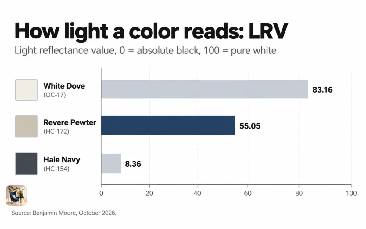
Use LRV to compare colors you are already considering. In a dim north-facing room, a color with a higher LRV keeps the space from going gloomy. In a bright room, or one where you want a cocooning feel, a low-LRV color can work well. Comparing LRVs also helps you pick a trim and wall pair with enough contrast between them.
Choose the sheen by room
Sheen is how shiny the dried paint is, and the right one depends on how much wear and moisture the room gets. Sherwin-Williams lists sheens from flat, which reflects almost no light, up through matte, eggshell, satin, semi-gloss, and high gloss. More shine is easier to wipe clean but shows every dent and roller mark.
| Room or surface | Sheen Sherwin-Williams suggests | Why |
|---|---|---|
| Ceilings | Flat | No reflection, so flaws and glare stay hidden |
| Living and dining rooms | Eggshell or satin | A balance of soft looks and easy care |
| Bedrooms | Eggshell or satin | A soft, calm finish |
| Kitchens | Semi-gloss | Easy cleaning around cooking |
| Bathrooms | Satin or semi-gloss | Stands up to moisture |
| Trim, doors, and cabinets | High gloss | Durable, with a crisp shine |
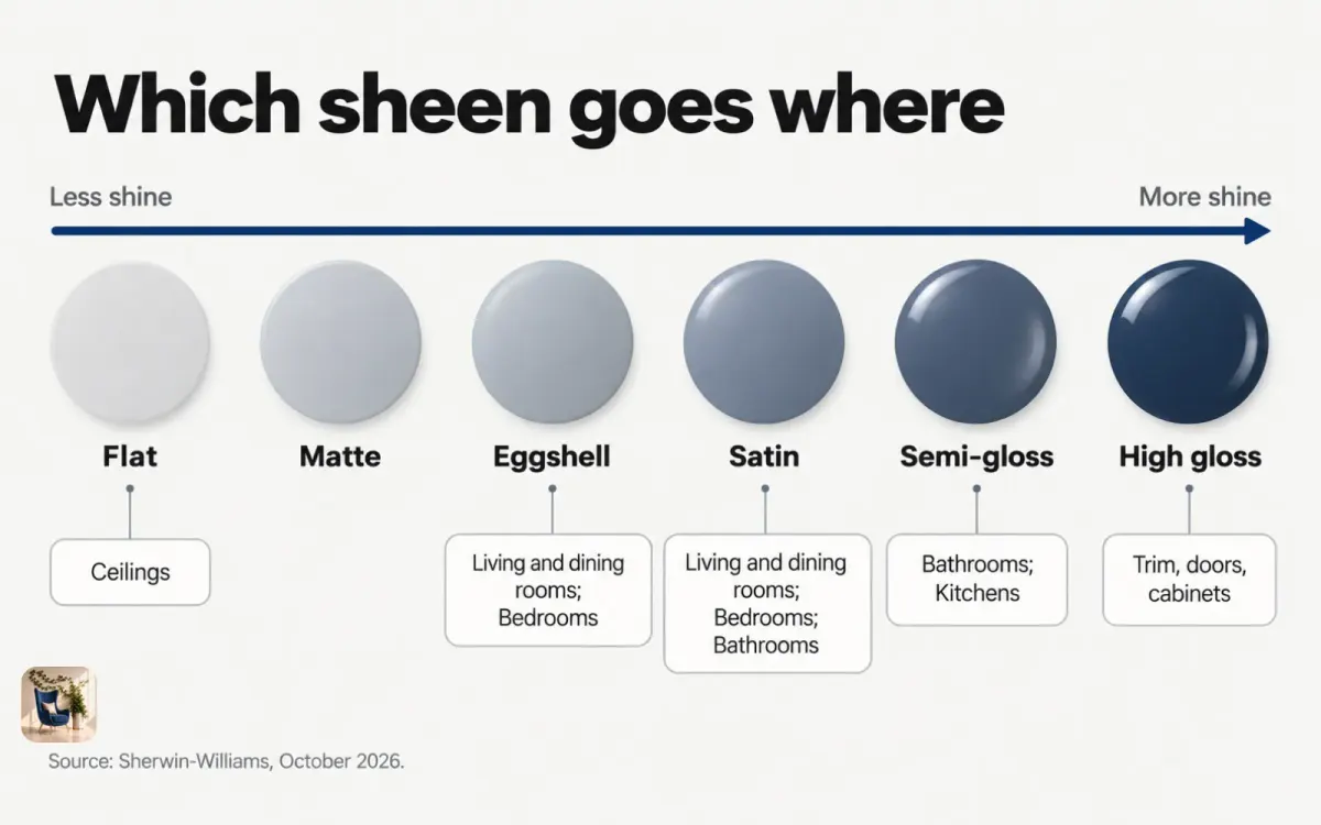
Sheen changes how a color looks, too. The same color reads a little darker and richer in a shinier finish, so if you test in one sheen and buy another, expect a small shift.
Make the colors flow from room to room
Rooms you can see from each other should share something, whether that is an undertone, a light level, or a common trim color. Stand in your entry and look down the hall: every room you can see at once is one view, and the colors in it should feel related.
Three simple ways to keep that flow. Use one trim and ceiling white through the whole home. Keep the undertones on the same side, so a warm greige in the living room sits next to a warm white in the hall instead of a blue-gray. And if you want a bolder color, put it in a room with a door, like a bedroom, office, or powder room, where it doesn't compete with the open areas.
How to choose a paint color, step by step
Follow these steps in order and you will end up with a short list that fits your room instead of a chip that looked good in the store.
Step 1: List what stays
Write down the floors, counters, tile, and large furniture that will stay, and mark each one warm or cool.
Step 2: Note which way the windows face
Use a phone compass in the room. North light calls for warmer, more saturated colors, while south light lets you use almost anything.
Step 3: Pull five candidates with the right undertone
Choose five colors whose undertones match your list from Step 1. Check each one against white paper to confirm the undertone.
Step 4: Compare their LRVs
Look up each color's LRV and drop any that are too dark for a dim room or too pale to give the contrast you want against your trim.
Step 5: Preview the shortlist on a photo of your room
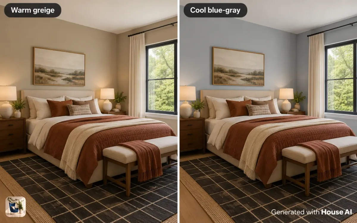
Take a daylight photo of the room, open Wall Design in House AI, and describe each color in your own words. Each design takes about 15 seconds on average, and every user gets 3 free designs a day with no credit card, which covers three candidates on one photo. Cut the ones that clash with your floor or furniture.
Step 6: Pick the sheen, then confirm with real paint
Choose the sheen from the table above, then test your final two or three colors with real paint samples on the wall before you buy gallons.
What AI can't tell you about paint color
A photo preview is good for judging mood, contrast, and how a color sits with your floor and furniture. It can't show the exact color. Screens and cameras shift color, so screen color is not paint color. AI doesn't measure your room or your light, and small details can drift between the render and real life. Use the preview to cross colors off, and make the final call with real paint in your own light.
Design any room, shop or space with House AI in about 15 seconds. 1 free design a day.
Get Started TodayFrequently asked questions
What is the first step in choosing a paint color?
Start with what stays in the room. Floors, counters, tile, and large furniture are hard to change, so the paint has to suit them, warm with warm and cool with cool.
What paint colors work in a north-facing room?
Benjamin Moore suggests more saturated colors with a warm yellow or red undertone. Colors with gray, blue, or lavender undertones tend to look dull in cool north light.
What is a good LRV for paint?
It depends on the room. A higher LRV reflects more light and suits dim rooms, while a lower one feels deeper and closer. Benjamin Moore lists White Dove at 83.16 and Hale Navy at 8.36, which shows how wide the range is.
What sheen should I use for walls?
Sherwin-Williams suggests eggshell or satin for living rooms, dining rooms, and bedrooms, semi-gloss for kitchens, and satin or semi-gloss for bathrooms. Flat suits ceilings.
Should every room in a house be the same color?
No, but rooms you can see from each other should share an undertone or a trim color. Save bolder colors for rooms with doors.
Keep reading
- AI Wall Design: Try Paint Colors On Your Walls
- Understanding Color Psychology in Your Bedroom
- How to Choose the Perfect Lighting for Every Room
- How Do I Mix Wood Tones in a Room?
- How Do I Make a Small Room Look Bigger?
Sources: Benjamin Moore UK, guide to how light affects paint color, no page date. Benjamin Moore, LRV definition on its HC-188 color page (benjaminmoorefrance.com), no page date. Benjamin Moore color pages for White Dove OC-17, Revere Pewter HC-172, and Hale Navy HC-154, no page date. Sherwin-Williams, "How to Choose Paint Finishes," no page date. All checked October 3, 2026. House AI figures come from the House AI app.